Monday, 16 April 2012
Wednesday, 28 March 2012
evaluation question 5
How did you attract your target audience?
From my primary research i found that my target audience of 15- 35 like good horror films with a rating of 15. They liked horrors that kept them on the edge of their seat, but was beleavable at the same time and something worth while paying to see. As my target audience was both male and female they couldnt be catered to one certain gender.
How is it evident in your work?
I think that its evident in my work as its clear that its a horror movie. I also think that it looks quite profesional so therefore it will look allot more beleavable. The people that acted in my film were both in the age range of 16-35 therefore my target audience would find it easier to connect with the caractors.
This is the rough cut of my moving image. From the feedback that both members of my class and my teacher gave me i made changes to it. Firstly I added more sound effects in the opening and at the end. This was done to build tension and also matched the theme. I also added lots of effects as in my feedback it stated that it needed to flow more and so i added fades in and out in order for this to happen.
I think that the mise-on scene attracts the target audience as its a typical house that someone of the age 16-35 would live in. Also the cinematography was the best that it could of been with the devices that we had to use therefore i think that it looked quite profesional and that is what the target audience are wanting.
Friday, 23 March 2012
My target audience evaluation question 4

Thursday, 22 March 2012
Wednesday, 21 March 2012
Monday, 19 March 2012
Tuesday, 13 March 2012
Creating moving image


To create my moving image i used 'final cut'. I firstly started by importing my files from photoshop like credits and logos. I then cut them to the right legnth and moved them so that they came on the screen directly after each other. Then i Got them all into the tight places i then used the different effects so that they faded in out out the way that i wanted them to the effects that i used where all in the final cut folder, i then dragged and dropped these to where i wanted them. I then went on to looking at music and sound effects for the opening titles. I used garage band for this, when i mixed the different effects i wanted together i then saved them as mp3 documents and imported them into my final cut document. I then cut them to fit with what was on the screen. I also changed the tempo of it to so that it didnt drown the images out. When the logos and credits where done i then imported my actual footage. I used the capture option in final cut to do so. I then started and stopped it where i thought where appropriate. I then added it to my document. I then had to cut out parts of the footage the whee not needed. I did this by using the razor tool on the right hand side and then using effects to edit them together so that it looked fluent. When these where done i then added fade ins and out so that the footage looked better when coming on and off the screen.
Creating logos on photoshop


Monday, 20 February 2012


By Monday 5th March I should have a rough cut of my products
By Monday 19th March my products should be completed
From Monday 19th - Friday 30th March I will be working on my 7 evaluation questions.
The my completed portfolio should be submitted for formal marking on Monday 16th April. I should use the Easter break to make any minor amendments to my work.
In order to meet these deadlines I will:
Making my soundtrack
making my sound effects
make my final logo
Take the camera and shoot
edit the shots
Edit and add diffrent effects
Thursday, 9 February 2012


Logo research

This is also a logo for a great, popular music company, 20th century fox television. I like the way they have made the writing look part of a building it looks really professional. The lighting is directed to the left hand side of the writing, this draws your attention to read from the left to the right of the screen. This also, like the logo above gives the impression that they are high up, as you can see clouds in the background with also makes you think that they are probably high budget films that the company make.

Thursday, 2 February 2012
Research into a potential target audience - secondary

Paranormal Activity 3 is a horror movie released on the 21st October 2011. It was directed by Henry Joost and Ariel Schulman. It was a high budget film and was very popular. By the poll showed in the picture the people that viewed the film where 53 % men and 47% female. This is pretty even as its rarely 50% each sex. This shows that the film was aimed at both sexes and not catered to just one. The film was rated a 15 so therefore no one under the age of 15 viewed the film. The majority of viewers where 15-24 with 79% which is almost 4/5 of the viewers. The rest of the viewers where 25-34 with 12% so this was the second most popular age range, also 35-44 with 3% and 45+ with 6%. I think the film attracted younger viewers more than others as teenagers and young adults are normally attracted to horrors.

The woman in black is a horror/drama released recently on the 10th feb 2012. Directed by James Watkins and the distributor is Momentum Pictures. This film is also a high budget film. Its about A young lawyer travels to a remote village where he discovers the vengeful ghost of a scorned woman is terrorizing the locals. the rating of the film is a 15 so no one under the age of 15 was able to watch the film. The most popular viewers where men. Men got 60% and woman 40%, in my opinion I think that this is because men normally enjoy horrors and violent a lot more than woman do. The age range of people that watched the film where a wide range. The two most popular age ranger where 15-24 and 25-34 both with 29% of the viewings. 35-44 got 15 % of the viewing and 45 + for 27%. Therefore the age of the people that viewed the film where wide range and there was not a spacific target audience.
Wednesday, 1 February 2012
Image analysis and composition

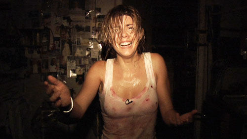
In this shot the girls ayes are in the top third of the screen. Although this makes her look more powerful her facial expression shows she is wanting help, although its confusing as shes smiling at the same time as looking vulnerable. The lighting is effective as the whole room is dark but her upper body and face is in the light. This draws our attention to these parts. Her costume shows that she has been in a violent scene as her how is covered in blood and also her body looks wet. Her body looks like she is reaching out with her right arm for help.

In this picture the girl in the shot looks helpless, this is shown by her body language. The was she has been dressed makes her look feminene and it looks like she may be taking part in a dance. The lighting is shining on the left hand side of her face and that's where my attention is drawn too.Her aye make-up is quite dark all round the eyes that makes her look quite harsh. Her facial expression is miserable and is frowning a little.
Tuesday, 31 January 2012
peer assessment of storyboard
Peer assessment comments;
positive
To change my work to make it better and get a better grade i am going to change the mise on scene. Firstly im going to change the setting that i am going to use when filming. I am going to look for a place that fits with the horror theme, so therefore i want to find a place that is scary such as an obandened house or an old cottage. Also i am going to try and choose a better veriety of shots that i choose whilst filming. Another thing i need to do is make some good non diogetic music that i will use when the titels are on the screen, that will fit with the theme.
positive
- It is apparent in the story board of what the genre is in the movie. You can tell this by the choice of colors and the chosen shots.
- There is a good amount of titles and credits and they are appropriate
- The mise on scene needs to be more appropriate and relevant to the theme. Such as a scary old house to fit with the horror theme
- The non diegetic sound needs to be effective and fit with the chosen genre.
To change my work to make it better and get a better grade i am going to change the mise on scene. Firstly im going to change the setting that i am going to use when filming. I am going to look for a place that fits with the horror theme, so therefore i want to find a place that is scary such as an obandened house or an old cottage. Also i am going to try and choose a better veriety of shots that i choose whilst filming. Another thing i need to do is make some good non diogetic music that i will use when the titels are on the screen, that will fit with the theme.
Tuesday, 24 January 2012
primary audience research
I conducted some primary audience research.
The target audience i am aiming at is quite a wide range audience although it would be aimed at over 15 year olds as it is a horror. Most people that watch horrors will of watched many high budget horror films and therefore i will need to make mine look quite profeshional. My target audience will be teenagers and young adults. Things with lots of action appeal to this target audience as they like to be hooked on a film. They also like drama and a good storyline. The things that teenagers don't like are classical fonts and colour's. I think that a horror is a great theme for my movie as it has loads of drama and is one of the most popular with this age group.
This is the starting sequence of the movie i chose to be analised
The questions that i asked people in my class where;
What do you think of the font used in the credits?
What do you think of the way the credits are presented on the screen?
What do you think of the music used on the credits?
How does the music fit with the theme of the movie?
What do you feel when you watch the opening sequence?
What three things do you like about the opening?
Friday, 6 January 2012
Thursday, 5 January 2012
research into similar products
http://prezi.com/7_qnkpn4s5pn/foundation-portfolio/?auth_key=2b4c885a08de42da9a4d40271ab0ad84213dbfde
brief
VIDEO
Preliminary exercise: Continuity task involving filming and editing a character opening a door, crossing a room and sitting down in a chair opposite another character, with whom she/he then exchanges a couple of lines of dialogue. This task should demonstrate match on action, shot/reverse shot and the 180-degree rule.
Main task: the titles and opening of a new fiction film, to last a maximum of two minutes.
All video and audio material must be original, produced by the candidate, with the exception of music or audio effects from a copyright-free source.
Wednesday, 14 September 2011
Monday, 12 September 2011
Covers and contents pages of inspiration
Below are examples of magazine covers and contents pages that i am talking inspiration for my prelim.


I chose the Galaxie front cover as it is very eye catching and it has makes good use of the photo. I think the way the. The mast head is creative and unlike most others.
I chose the new york front cover as i like the font choice as it makes the magazine look expensive. The picture is quite unusual. The main sell line is nice and bold and catches attention.

I chose this contents page from a magazine because it is quite bright and the pictures are really colourful. It looks really modern and fashionable The font choice is nice as it fits with the chosen style. I also like the layout of the text and there is also just enough text on the page.

I chose this summer magazine as it is pretty basic but i think that it works very well. the colours contrast really well with
the white background giving a
summery feel. the pictures
are a nice size and i like the
layout of the page.
I chose the new york front cover as i like the font choice as it makes the magazine look expensive. The picture is quite unusual. The main sell line is nice and bold and catches attention.
I chose this contents page from a magazine because it is quite bright and the pictures are really colourful. It looks really modern and fashionable The font choice is nice as it fits with the chosen style. I also like the layout of the text and there is also just enough text on the page.

I chose this summer magazine as it is pretty basic but i think that it works very well. the colours contrast really well with
the white background giving a
summery feel. the pictures
are a nice size and i like the
layout of the page.
Brief: print
Prelim exercise: using DTP and an image manipulation programme produce the front page of a new school/college magazine, featuring a photograph of a student in a medium close-up plus some appropriately laid out text and a masthead. Additionally, make up the contents page.
Main task: The front page contents and and double page of a new music magazine.
A minimum of 4 images must be used. All images and graphics must be produced by the candidate.
Main task: The front page contents and and double page of a new music magazine.
A minimum of 4 images must be used. All images and graphics must be produced by the candidate.
Subscribe to:
Posts (Atom)